Wendy Heard Intro:
One hazard of being an author with art degree is that people ask me why I don’t design my own book covers. Through gritted teeth, I always try to explain how specialized a skill book cover design is and how utterly unqualified I am to do it with my decade-old degree in painting, and then I usually run far, far away before I get asked to explain more things about the publishing industry.
When the cover art for my debut, Hunting Annabelle, landed in my inbox, I took a deep, nervous breath. I’d been having nightmares about this for months. In my nightmares, the protagonist would be depicted on the cover, looking at me through his bangs with a longing, emo stare, and Hunting Annabelle would be splashed across his chest in giant, pink bubble letters.
What I got when I opened the file was an incredible, striking cover that immediately conveyed all the most important things about the book: Art– mystery– Annabelle– secrets– longing– darkness.
How did they do that?
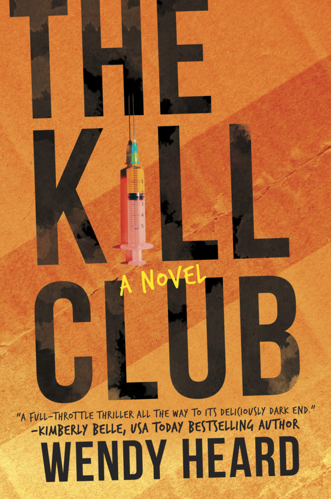
Not long ago, the cover art for THE KILL CLUB arrived as an attachment to an email. I wasn’t having nightmares about emo dudes and bubble letters, so I opened the file with excitement. There it was: a cover I loved maybe even more than Hunting Annabelle’s. Again, they had done it. They had managed to say all the most important things about the book in the most elegantly subliminal ways.
I had to know more about their process. I reached out to my editor, April Osborn at MIRA Books, who in turn reached out to Kathleen Oudit, and the following interview is what ensued.
Wendy: Hi Kathleen! I am both excited and grateful that you’re taking the time to answer these questions. I’m such a huge fan of your work, and I get a ton of comments from people about how striking the Hunting Annabelle cover is. And then with The Kill Club, when I opened the file and saw the hot, heavy-hitting composition, I was blown away again.
So here’s my first question. How do you work with the editorial, sales, and marketing teams, as well as your own team? How do all these people collaborate to produce this product?
Kathleen: A book cover is a product package. It needs to represent what is under the cover, But its first function is to communicate multiple messages in a glance: That this book promises you, the reader, an experience that is funny /moving/ emotional/ informative/ sexy etc. That, if you are a fan of this TV show/ movie/ other book, then THIS book will deliver similar enjoyment. Crafting those messages determines the way we are going to sell the book – and to whom. We refer to this as “positioning”. It’s a strategic as well as qualitative process that needs the collaboration of the whole publishing team to work. There is fluidity in the process: the art team needs editorial and marketing to give them parameters for their work, but the art team can also provide examples of different “spins” on a cover to gauge whether we’ve got the right positioning.
Wendy: I notice you pick certain elements from a story to use on the cover. How do you choose those?
Kathleen: Sometimes the editor provides a list of specifically described people and items and we can immediately search for matching reference images. Sometimes we know story context only, and we extrapolate from it what might be plausible and interesting. Other times we try to craft a
visual metaphor out of a circumstantial or psychological description, when a physical representation is too prosaic—or worse, problematic (a story involving child abduction, for
example). But the final handling of those elements is always informed by the “positioning” of the book.
Wendy: One thing I think is amazing about cover design is it does a ton of work conveying genre with basic design elements like color, font, composition…How do designers know what elements will read as thriller, or scifi, or fantasy, etc?
Kathleen: This is a tough one to answer.
Shared culture defines the semiotics of what we use to tell a story. A stormy sky might be a straight narrative depiction of the weather in a crucial scene – but it could also be a visual metaphor for danger, or chaos. Or, passionate sexual tension. “Storm” has all those meanings after centuries of depiction in literature, theatre, paintings and music. But whether we chose to include the storm literally or figuratively on a cover is most likely decided by genre and positioning.
Genre is conveyed by adopting the style conventions already used to communicate the traits associated with that genre throughout our culture. TV, movies, video games, past and recent book covers, even music and fashion collectively and continually feed a visual shorthand that we all draw from. These styles can arrive as short-lived trends following the breakout success of an iconic movie or new book. They can appear in our culture with a societal event or the introduction of a new technology. (Think of all the sci fi fonts based on a primitive computer-generated text from 40-50 years ago). They can shift as quickly as fashion or be timelessly rooted in art history. But, they may not be universally shared by all nationalities or generations and require learning a new set of conventions.
I am struggling to describe the breadth and mutability of what underlies a designer’s decisions. But it is most certainly skill earned with experience, and a learning process that never ends. Designers continually absorb and study the culture and visual communications around them. After years of harvesting it, and reflecting it back, it becomes faster to speak that way than with words. (Which is one reason why this paragraph took me far too long to type!) But it is one of the key roles art directors play in the process –their experience and understanding of the positioning leads and focuses the designers efforts.
Wendy: Are there any cover designers of whom you are a huge fan? Or any favorite cover designs outside your own work?
Kathleen: I truly have the most immense respect for the art directors and designers in the Harlequin art team. And, that respect extends to every in-house cover design team in the industry, including our competition!
We look at each other’s work daily. Every new concept that an individual designer comes up with, builds the glossary of visual vocabulary that we all work with. Any creative who successfully gets approval on a direction that pushes up the ceiling, raises it for us all. My heroes are those who come in everyday and create honest and carefully positioned packages to enclose an author’s work.
95% of that work will never win those designers an accolade in a design competition.
They will almost never be known by name, but their work will enter thousands (sometimes
hundreds of thousands) of homes!
How we made THE KILL CLUB cover:
After a meeting with the editor and the marketing product manager, we identified that we wanted to position this as a book for the thriller fan — with a distinction. The younger, female protagonist who “saves herself” had the potential to stand out from others in its genre; but the strong title lent itself perfectly to a bold type driven design which would keep it clearly in the category. I also left the meeting with a list of objects taken from the manuscript: a syringe, a shipping box, a playing card, a cellphone and other items I don’t want to name for fear I reveal a spoiler.
I took this information to designer Mary Luna, and in our discussion, we prioritized what needed to be communicated:
1) This book is a Thriller – make the title the main genre cue using typical fonts and size in the composition
2) Give it a “poster-like” design; bold, clean and simple. This could reference the book/movie Fight Club – cueing a similar unconventional and arguably “younger” energy. Let readers know this is not a procedural or domestic thriller.
3) Use the objects listed to either create an enigmatic “trail of clues” or bring dimension to typography focused layout. (We would try both)
The chosen design imagines the cover as the lid of a packing box with the title stamped on it boldly. The orange colour is unexpected. The deceptively cheerful shade pops on the shelf, avoids being another iteration of a black/red/white cover typical of the genre and it also references another significant object from the story (the orange). The syringe becomes the letter “I” literally putting the weapon in the word. It also adds a third dimension and focus to an otherwise flat surface image.
Wendy: Thank you, Kathleen, for your carefully crafted responses and your beautiful work on my covers. It’s a beautiful, communicative art form and I admire you all greatly!
THE KILL CLUB Cover Team with Instagram Handles:
Art Director: Kathleen Oudit @kathleen.oudit.creative
Cover Design: Mary Luna @maaruluna
Images from: Stocksy & Shutterstock
Harlequin Art Dept: @harlequin.art.dept
 Kathleen’s Bio:
Kathleen Oudit is an Art Director and Graphic Designer who has worked in product design and publishing over 20 years. Currently she is an Art Director for Harlequin Trade Books, a division of HarperCollins. She lives in Toronto, and studies vocal jazz on the weekends.
 Wendy’s Bio:
Wendy Heard was born in San Francisco and has lived most of her life in Los Angeles. When not writing, she can be found hiking the Griffith Park trails, taking the Metro and then questioning this decision, and haunting local bookstores.